
Branding
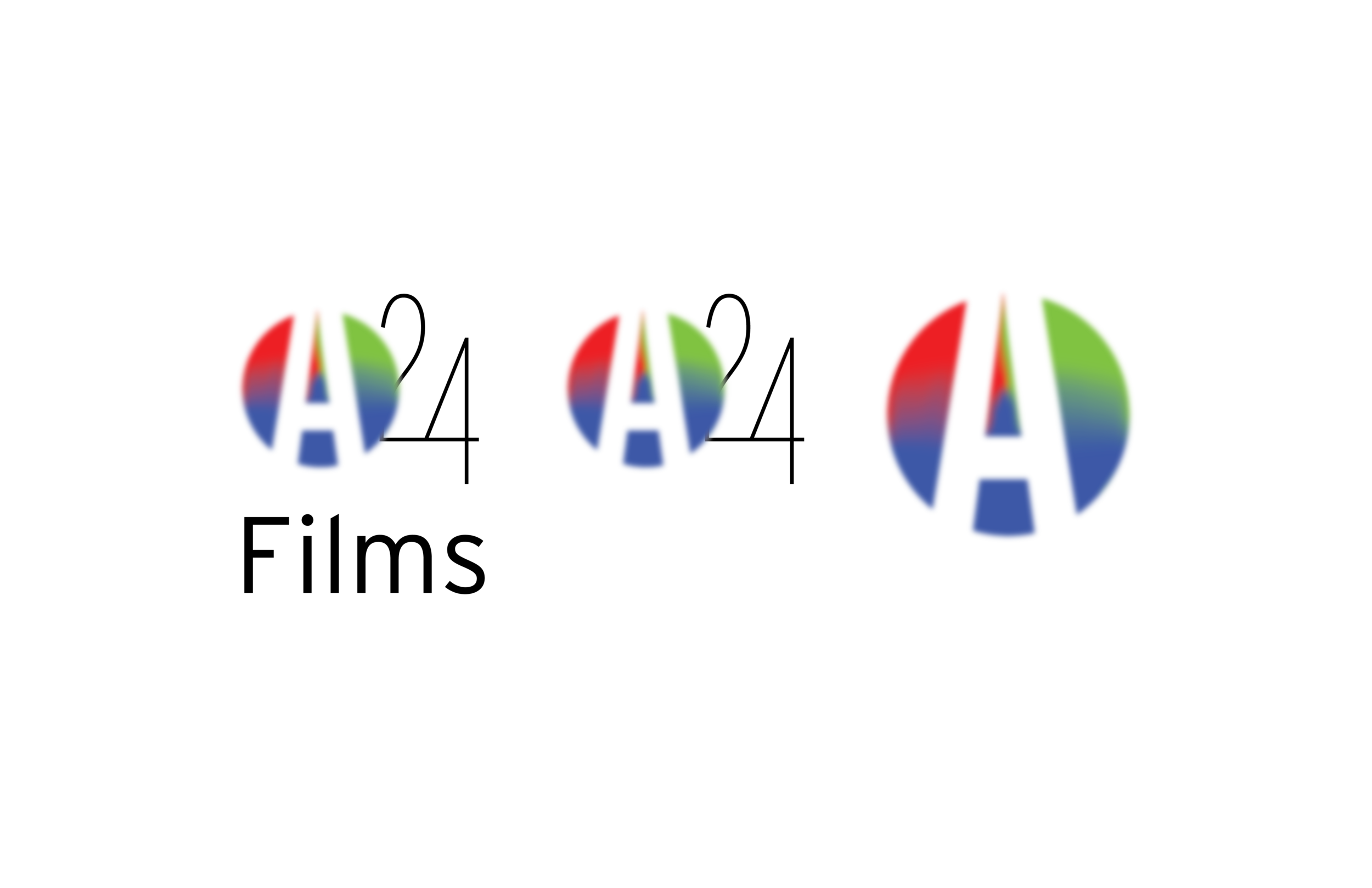
A24 Films
Revitalize the logo, by adding in graphic elements and an abstract logo. Some more colors couldn’t hurt either. A24 had a word mark logo right now that carries their brand. They don’t have a lot of added design elements and stay in the serif font used in the logo or the lineal font they use absolutely everywhere. They stick to simplistic of white and black on their sight letting their films stand for themselves. I would assume that this ties to their goal of not interfering with the films they take on.


Process Work
-
Mindmap

-
Mood Board

-
Logo Sketches
